Journaling to clarify inspiration - my process
I’ve always found it easiest to process my innermost thoughts and feelings by writing. I kept a journal on and off from childhood through most of my adult life, but for some reason let that lapse in the past 10 years or so.
I’ve recently returned to journaling in my art practice and have found it so helpful to understand the “why” behind things that inspire me. It also helps me to transform that gut-level inspiration (which is often beyond words) into practical guidance for where I want to go next in my art.
For example, during a trip to Tuscon, Arizona last April, we did a bike tour of the historic city center, which took us through Barrio Viejo (“old neighborhood” in Spanish). When I saw the low-slung old adobe houses in brightly painted colors, I could feel the inspiration kicking in. I went back the next day to wander the streets and soak it up some more.
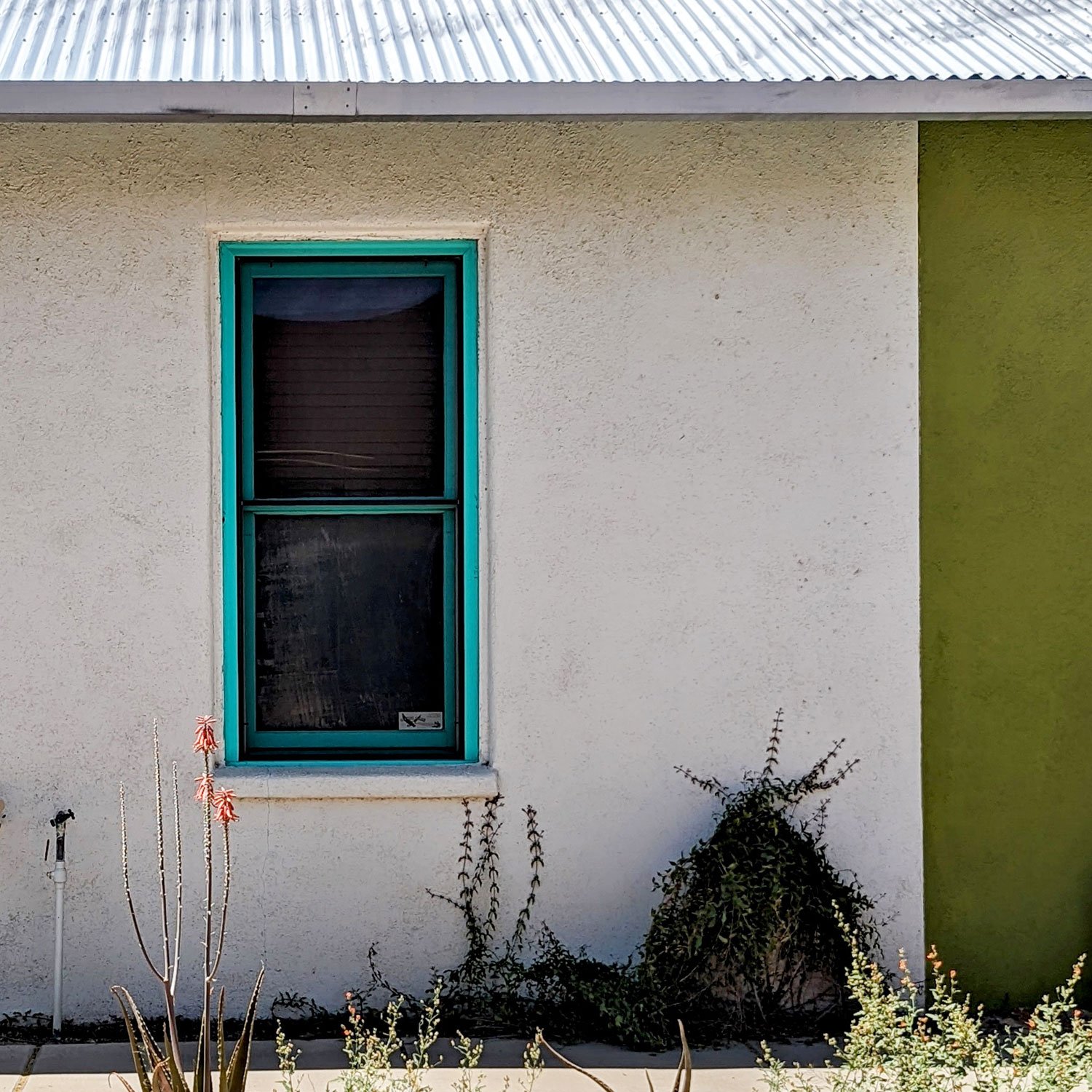
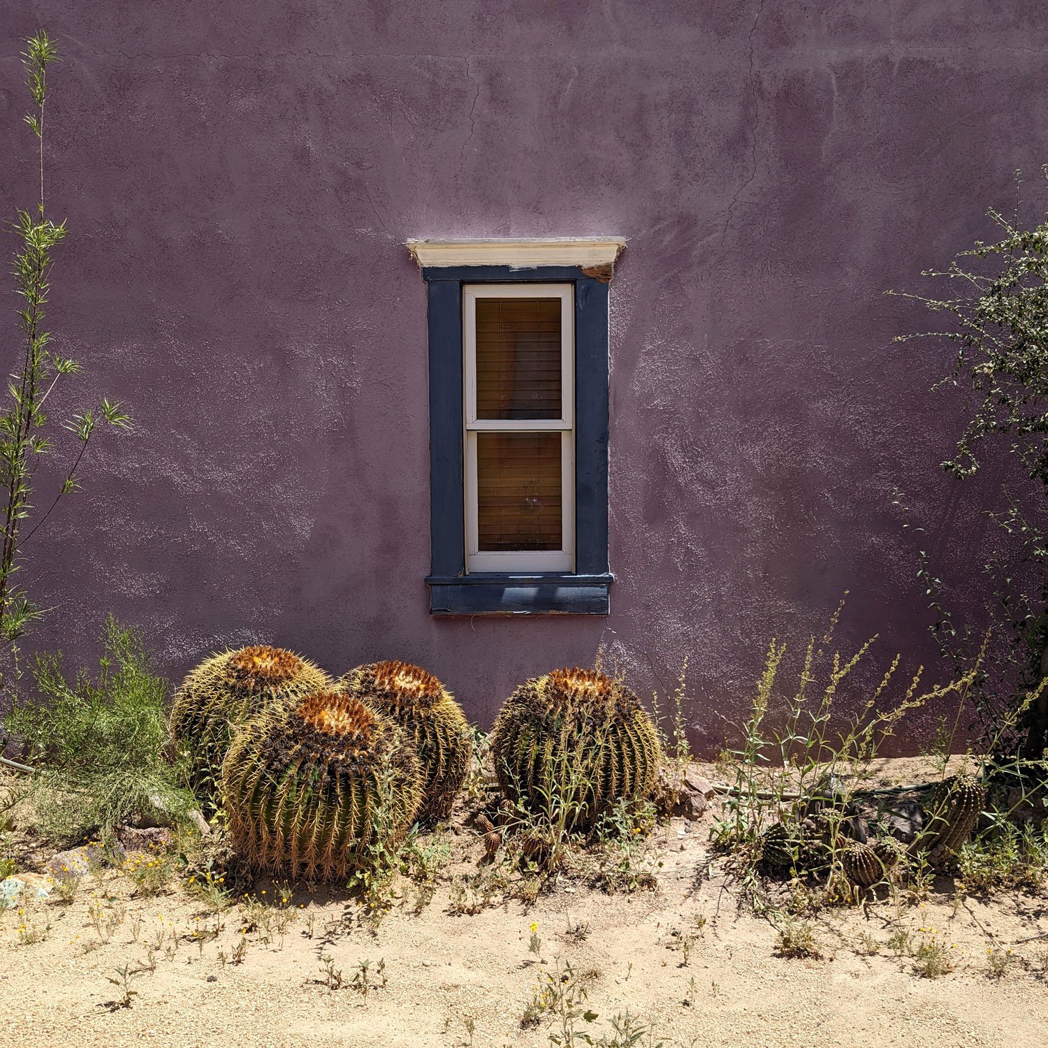
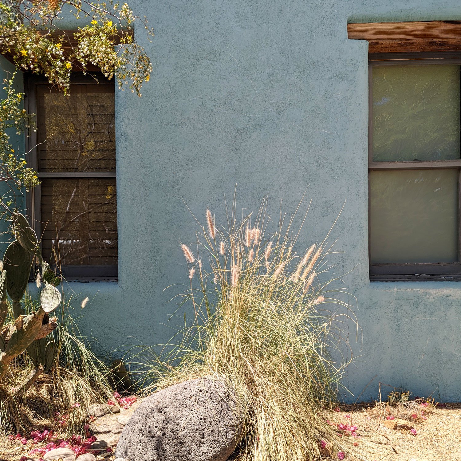
Upon returning home, I analyzed the many photos I’d taken and did some journaling to better understand what I loved about Barrio Viejo. My main takeaway was that I was really drawn to the bright geometric shapes (walls, windows, doors, etc.) against white and shades of gray. The words “spare,” “clean,” and “simple” also popped up.
I decided that I wanted to continue what I’d started in my Oaxaca series – abstracting architecture and contrasting it with organic forms like plants and trees – but in a more bright, clean, spare, and geometric way.
I then used the following questions to dig deeper, as I learned from UK artist Louise Fletcher last year in her Find Your Voice course.
Q Why does this idea appeal to me?
A I love old cities and neighborhoods with lots of history. They’re like a person with a distinct personality and story that is continually evolving. The people who choose to live in neighborhoods like that are often artists or people who appreciate the unique character of these places. It all feels very alive and energizes me.
Q Why is this important to me?
A I want to draw more on my roots in weaving and quilting, crafts that are both very grounded in geometric shapes and lines. I also love gardening, plants, and organic forms. Something about the balance between the two is important for me.
I’m also fascinated by visual snapshots where I capture smaller parts of a city landscape and put them together to capture the overall feel. I want to paint the essence of what my eye is drawn to and the feeling of a place.
Q I want to paint brights with neutrals; clean, simple, and graphic contrasted with organic. This feels like me. Why?
A I love all of those things! My home decor and wardrobe reflect that. Where I like to travel and spend my time reflects that. Living in Seattle makes me appreciate and crave the sun and brightness more, but I also sometimes find the gray of the Seattle landscape nourishing, calming, and grounding.
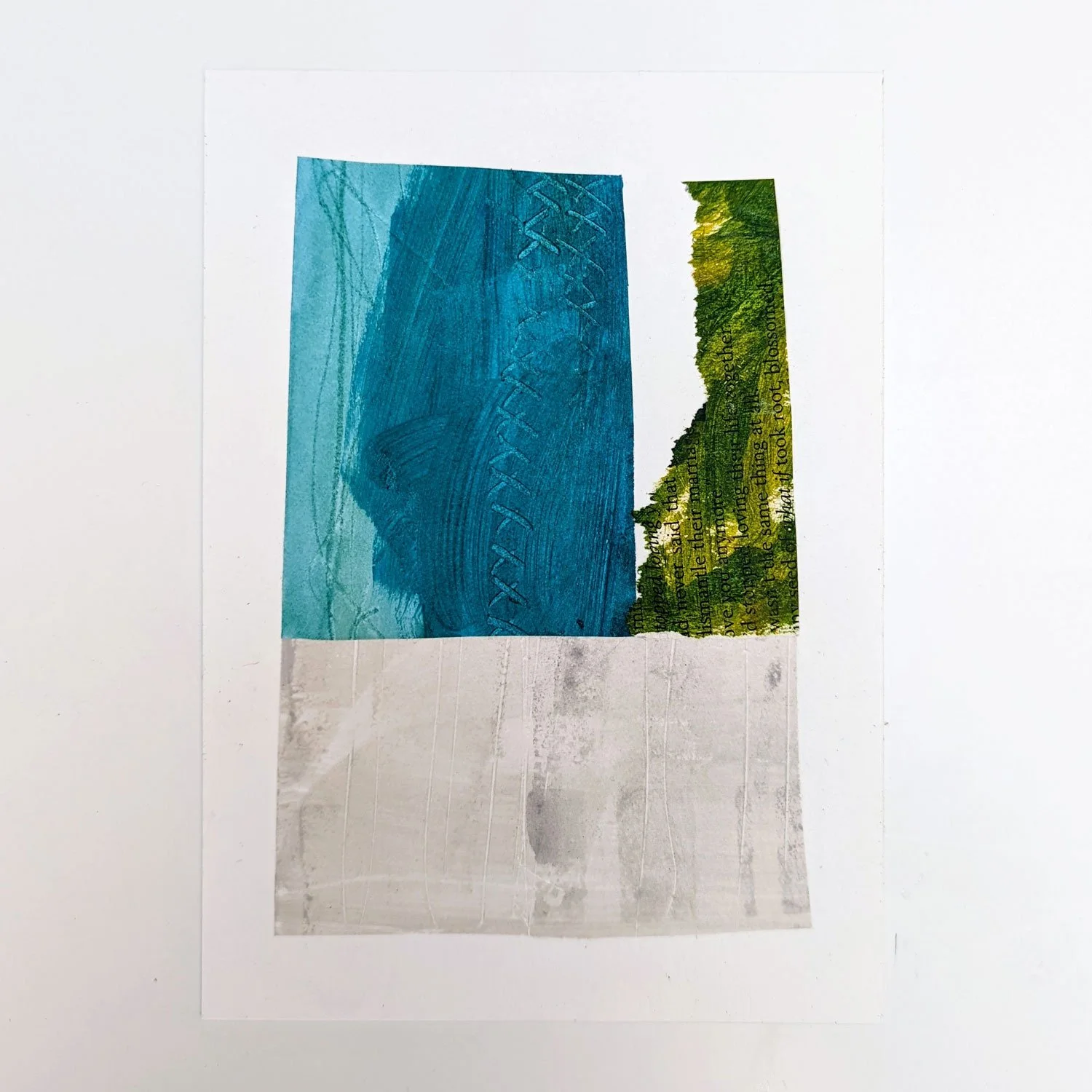
Next I moved on to developing a color palette — bright red, yellow ochre, turquoise, lime green, and gray — as well as some sketchbook pages and small collage pieces to further explore these ideas.
I then started and completed a series of small and medium-sized paintings based on these themes. Most of these paintings have now sold, but you can see currently available work at the link below.